Earlier this week I had a friend send me a Twitter DM saying, “Man…you MUST check out the new Walker Art Center website.” So I headed over there that evening and spent over an hour reading, poking around and seeing what they’d delivered.
To say I was impressed is an understatement: the design is fresh, exciting to view and the content compelling. The breadth and depth of coverage of art and design quickly shifted my mind toward a completely different place, one of consideration, thought and ideas instead of my typical focus on the tech “flipper-flappers” and “eye candy” of this new website they’d delivered.
Others agree. In his post at ArtInfo “Why the Walker’s new website is a big deal“, Tyler Green calls it a “game changer” since the Walker site is atypical for a museum, usually an informational site intended to lead visitors to the art institution’s building and its exhibits. Instead, argues Green, the site redefines how the Walker sees its role: as both a physical and as a virtual hub.
Walker Art executive director, Olga Viso, wrote this article about their new site, saying in part:
“As the Walker’s name signals, we’re a center: a hub that brings together various pursuits related to contemporary art, from presenting the visual, performing, and media arts of our time to publishing the latest scholarly research; collecting art objects and commissioning new works to hosting artist residencies and convening public discussions about art and ideas. Given these activities—and more importantly, our mission to investigate the questions that shape us and inspire us as individuals, cultures, and communities—I’m excited to introduce our new website, an online hub for ideas about contemporary art and culture, both inside the Walker and beyond.”
Talking about the why of launching such an ambitious site redesign, Viso said, “The intent of the new site is to make visible our role as a generative producer and purveyor of content and broadcast our voice in the landscape of contemporary culture.”
Any downsides or critique? Two, but the first is a biggie and the second not so much.
Neither of these gripes is a deal-killer for the new Walker website, but this first one needs to be fixed immediately.
My preferred device for consuming content is, like many of us, an iPad. The only issues I had on the new Walker site was while attempting to watch videos on the Walker Channel as you can see below. If I did click on the “…direct link to the video on YouTube” link it would, of course, make Safari on iPad go away and then it would launch the YouTube app! NOT a good user experience and one UX hiccup in an otherwise awesome, designed experience that the team should fix ASAP.
The other, more minor issue was the homepage load speed — it loaded quickly on a computer (under 4 seconds) but took over 13 seconds to load on my iPad (that on a non-cached-Safari & wireless connection speed averaging 19mbps download speed. Testing occurred one evening at 8pm, 11pm and 9am the next morning). Thinking it might be a Safari issue, I tried loading it on the iPad using alternative browsers Opera Mini, Terra, Atomic Web and iCab Mobile. All delivered the Walker site between 12 and 14 seconds on average.
Speed matters not just for a great user experience, but Google has been very explicit about pagerank and speed starting in 2012. Part of their algorithm will be set to rank based on current standings and links in, of course, but speed is a close second. It’s because Google’s use of computing resources and bandwidth are so enormous that they are trying to drive us all toward making our sites as efficient as possible so as to reduce their consumption of resources and bandwidth. The unknown is how Google will rank “mobile friendly site speed” in their algorithms and I’ve not tested the site on an Android tablet in my same wireless conditions, so cannot attest to the user experience on Android tablets.
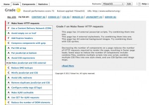
Running YSlow on the Walker homepage gave it a grade of “C” and a performance metric of 73. As a comparison, Minnov8 gets a “C” and a metric of 72, but we’re a bunch of hacks compared to the top-notch team at the Walker, and we’re long overdue for a site redesign.
I was impressed to see, however, that the Walker team has deployed nginx (pro. “engine x”), a web server known for its speed. When you take in to consideration the richness of their magazine-like homepage, it’s tough to fault them for not having a score in the 90s quite yet. I suspect they will continue to optimize the site over time.
AN ACHIEVEMENT THAT IS AN ASSET TO MINNESOTA
To the team at the Walker, we salute you for an ambitious and amazing new site. There is no doubt it will prove to the world that the Walker is a first rate, thought leading institution that comes from a State with a creative class that is also second-to-none in the world. Your new site will also raise the consciousness of the imperative of great design in everything we touch, the products and services we deliver, and the need to recognize artistic beauty in new ways.


