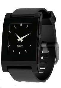
 If you’re a regular listener to our Minnov8 Gang Podcast you’re aware that I was a major…er…one of the first…um…ok, an investor in the Pebble watch Kickstarter campaign. You also know that I get a good deal of questions like, “Have you got that Pebble yet, Phil?” or “How’s that Pebble working out?” from the rest of the Gang.
Who knew that after ponying up some of my hard earned shekels to help fund one of the most successful campaigns on Kickstarter…and to get me a nifty geek watch…Pebble would become the poster child of what can happen when you over-promise.
Well, huzzah! My Pebble has arrived and I wanted to share some first impressions. (You can see my version of an “unboxing” below. What’s up with unboxing videos anyway?)
[youtube=http://youtu.be/53_yOAF74bg]
First and foremost, the design is very slick. The screen and body are one, with no gaps or raised edges like that found on a regular watch where the crystal and body come together. While I’d like to see a band that is as wide as the square watch itself the black rubber band is of good quality.
Pairing it with my HTC Evo via Bluetooth was a breeze. I’ll have to admit there was a bit of head scratching to set up the sync with mail etc. Set up is not all that intuitive once you get past pairing and it took me a bit of time to actually locate the settings. The Pebble app relies on both it’s own visible menu bar as well as a settings function accessed by the Android menu button. It’s quite obvious once found, making me feel a bit like a dolt for not checking that first.
I was prompted to update the firmware and then was off and running. I selected the classic watch face and lashed it to my wrist. My first thought…I need a bigger wrist. Being a skinny kid from way back always becomes apparent when I try a new watch, but the Pebble really is very sleek. I’ll just have to bulk up a bit.
I’m still getting a feel for the need for this watch but here are the quick observations:
- The screen is a lower resolution than I expected with some pixelization to the graphics and fonts. However, it’s a watch, not a TV.
- I can’t find a way to scroll through multiple emails received at the same time. However, it may exist and I haven’t found it. (See above head scratching.)
- There’s no battery life indicator. I hook it up via the handy magnetic charging USB cable each night to be sure.
- I like that I’m notified regularly of incoming emails and texts. I often have the phone on vibrate and I miss calls and texts because I don’t feel the phone’s vibration. The Pebble alleviates that problem. That alone is makes me a fan.
- I love being able to control playing music on my phone. It’s great to keep the phone in my pocket and reach for my wrist when I want to skip or pause a track. I would so dig a volume control.
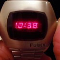
 The wearable technology space is growing and all in all the Pebble watch is a darn fine early entry in this soon to be competitive arena. The size and design of the Pebble raises its geek factor a little. It reminds me a bit of the early digital watches Those of you in my demographic can still remember the first digital watches from the 70’s (right). Ok, show of hands, who had a Pulsar watch? Oh look, some of you are still rockin’ one. (Sorry.)
I like this watch and many of my tech friends are a bit jealous that theirs hasn’t arrived yet…so that’s kinda fun. I’m looking forward to more apps. Soon I hope. So perhaps those who are waiting for the Pebble to arrive can take heart that more apps may be available by the time they unbox theirs.