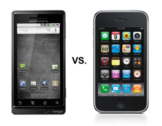
Or should I say “tears it apart”? No, seriously, my objective is to be fair here. As an independent blogger, I take the opportunity from time to time to do a review. And I was offered a Droid loaner a few days ago by local PR guru Al Maruggi, while we were at our Twin Cities Social Media Breakfast meeting. I told him, sure, I’d take a look at the new phone, which he handed me in the box, then return it to him today. What does all this have to do with Minnesota, other than the fact that both Al and I are located here? Well, let’s see — lots of people use smart phones in Minnesota? Yeah, that’s it! But, in my review process, I even downloaded Minnesota-produced Android apps to this brand-new Verizon/Motorola phone. And, hopefully, more than a few Minnesotans are interested in hearing about how the Droid stacks up. 
Note to the FTC: I’m not keeping the phone, guys — it’s a loaner! Of course, I don’t need it, anyway, since I’m now into my third year of unmitigated iPhone bliss, having upgraded to a new 3GS a couple months ago. Well, I should say bliss with Apple, not necessarily with AT&T. The latter is, of course, the only carrier choice in the U.S. for the iPhone — unless you want to jail-break your phone and void the warranty. People tell me they do that on T-Mobile and the phone works fine. But for those locked into a Verizon contract, or those convinced they can’t live without the better 3G network that Verizon claims it has — you know, the superior coverage they keep beating us over the head with in their ads? — then the Droid would seem to be the closest you’re going to get to the iPhone experience on Verizon.
The Experience
So, okay, let’s start with that — at least the initial experience. (And no company, hands down, does that better than Apple.) Which of the above phones would you rather have? It all starts with the home screen, I guess. Now, granted — on the Droid, if you touch the arrow on the tab at the bottom and slide up, you get a much better looking screen on with all your little app icons — and without the mottled gray background (what’s with that?) — but, overall, I have to say that the visual experience with the Droid doesn’t compare well with the iPhone. And I say that even knowing that the screen is supposed to be higher resolution than the iPhone (personally, I didn’t notice that much). I guess it’s really the “brand experience” I’m talking about here. And that applies to the box, the packaging, too. Motorola (or is it Verizon?) tried to come up with something here as good as the iPhone, but to me they missed the mark. Something about the darkness of the whole thing — the black, the gray, and then that goofy little glowing red ball on the screen (on both the package and all over Verizon’s promotional materials). Inside the package, though, the little “Getting Started” booklet is very nicely done — love the fanfold, and it tells you everything you need to know, quickly.
(NOTE: See the “Update” at the bottom of this post.)… [Read More…]